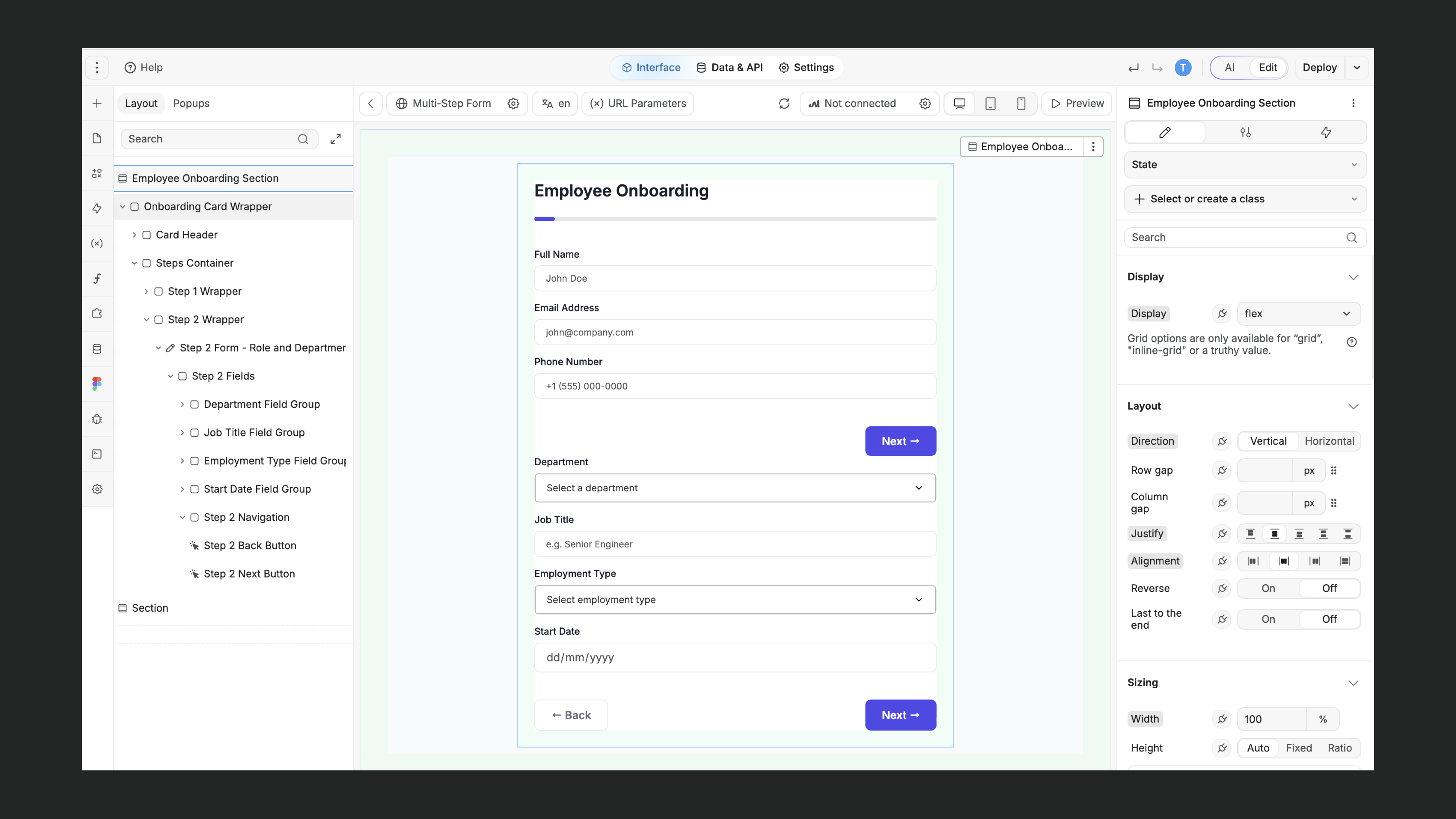
In today’s digital landscape, creating a seamless user experience is paramount to the success of any online endeavor. One critical aspect of this experience is designing efficient and user-friendly forms that cater to the needs and expectations of your audience.
Multi-step form design has emerged as a crucial tool in this regard, offering a plethora of benefits to both users and businesses alike.
In this article, we will delve into the significance of multi-step form design and explore how it can transform your digital presence.
We will provide valuable insights, best practices, and innovative strategies that leverage the power of WeWeb, a cutting-edge web design platform, to optimize forms for better user experiences and improved conversion rates.
Single-Step vs Multi-Step Forms
There are two main types of form designs: single-step and multi-step. Both single-step and multi-step forms serve as gateways for interactions between users and websites, facilitating everything from account creation and information gathering to online purchases and subscriptions.

Before you can decide if a multi-step form is the right choice for you, you need to understand the differences between these two types of forms. Let’s take a look at each form design’s characteristics and uses.
Single-Step Forms
Single-step forms present users with all the required input fields on a single page, typically in a linear format.
While they are simple and efficient for collecting basic information or conducting quick transactions, single-step forms can become overwhelming for users when dealing with a large number of fields or complex data.
Users may experience form fatigue, leading to frustration and abandonment.
Single-step forms lack the step-by-step guidance that can help users feel more at ease during the data submission process.
This type of form is most effective in scenarios where simplicity and speed are top priorities.
They are ideal for collecting contact information, such as email addresses, names, or phone numbers, where minimal user effort is required.
Single-step forms are commonly seen in:
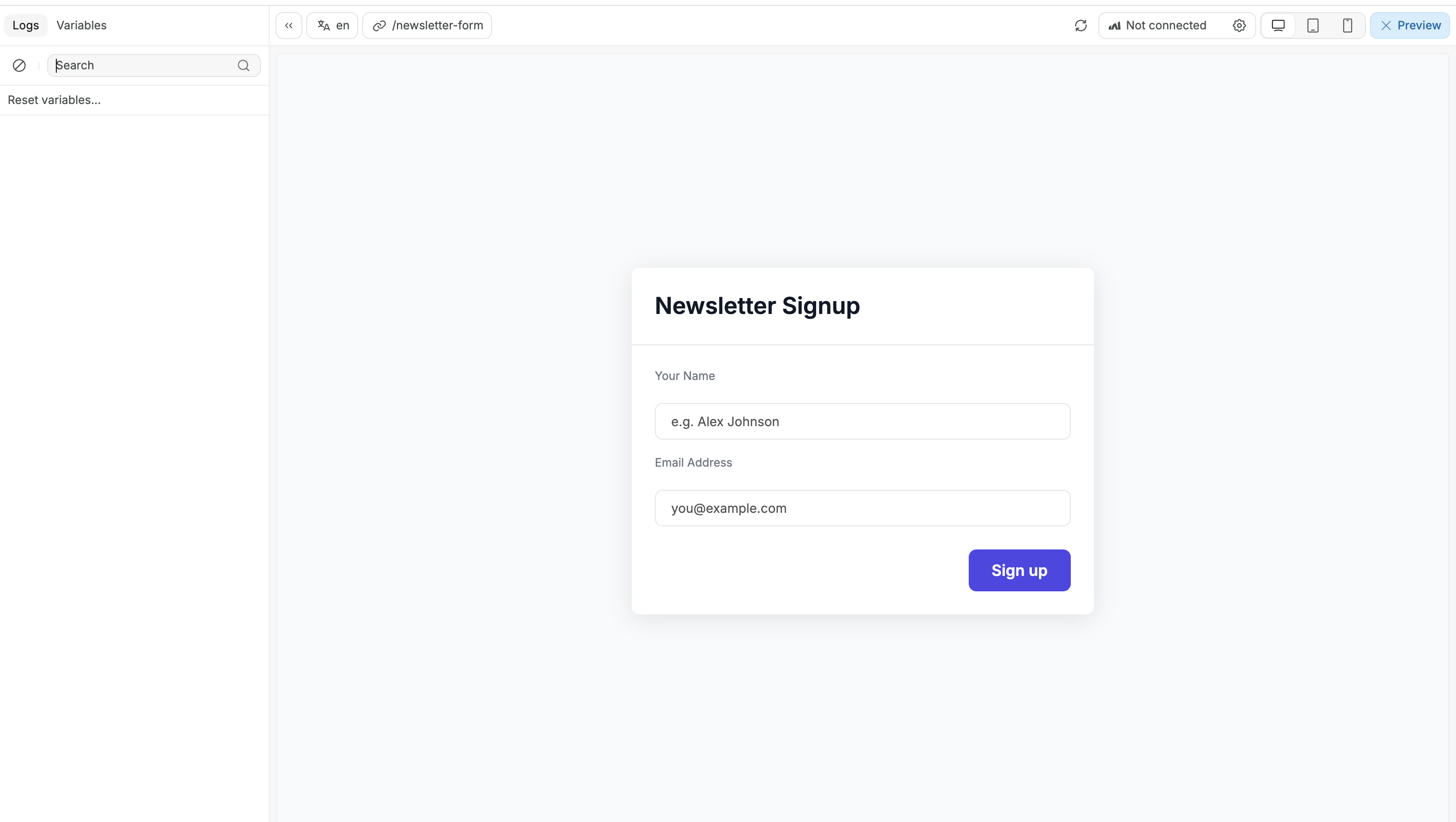
- newsletter sign-ups,
- simple contact forms, or
- quick registration processes for events and websites.
They are also suitable for straightforward e-commerce transactions with minimal product choices.
Multi-Step Forms
Multi-step forms—also known as multi-page or wizard forms—are a user-friendly approach to data collection and interaction on websites.
Instead of presenting users with all input fields on a single page, multi-step forms break the process into smaller, more manageable sections or pages.
Each step focuses on a specific set of information, guiding users through the process one logical piece at a time.
This approach significantly reduces the cognitive load on users, making it less overwhelming and more user-centric.
Multi-step forms enhance engagement, improve data accuracy, increase conversion rates, and allow for personalized experiences by tailoring subsequent steps based on user input.

They excel at collecting comprehensive information or conducting complex transactions without disrupting the user experience.
This type of form excels in situations where user engagement, data accuracy, and a well-structured process are crucial.
They are particularly effective when collecting extensive or complex information, such as during account registration, surveys, job applications, or detailed product configuration processes.
They enable personalized experiences, as subsequent steps can adapt based on the user's previous input.
Multi-step forms are also beneficial when businesses seek to gather context-specific data or when they aim to guide users through a step-by-step decision-making process, resulting in higher conversion rates and a more satisfying user experience. They are adaptable and can be used in both B2B and B2C settings.
Benefits of a Multi-Step Form Design
Multi-step form design benefits both users and businesses by:
- Enhancing User Engagement: By breaking down a lengthy process into more digestible steps, they make users feel less overwhelmed and encourage them to continue interacting. This can be done using things like buttons, share features, product rating requests, and more.
- Increasing Conversion Rates: When users start a multi-step form, they've already invested time and effort in the initial steps, driving them to stay committed to the form. By presenting fewer fields at each step, multi-step forms minimize the perception of effort required, making users more willing to continue.
- Personalizing User Journeys: Multi-step forms offer the advantage of tailoring the user journey based on their input, ensuring that users are presented with relevant questions and information. By adapting subsequent steps according to previous responses, multi-step forms provide a more context-specific interaction, leading to better data quality.
Multi-Step Form Best Practices
When designing multi-step forms, follow these 6 best practices to ensure an optimal user experience and high conversion rates:
1. Clarity and Simplicity
Keep forms simple and concise. Clearly communicate the purpose and the number of steps involved. Use descriptive labels and instructions for each field. Minimize distractions and unnecessary elements on the page.
To help keep your design simple, map it out on paper or with a tool like Miro before building it out. This will help visualize the form as a whole and highlight any complexities or missing logic.

2. Progressive Disclosure
In the initial steps, present the most crucial and basic information, such as requesting a user’s email and name. In subsequent steps, gradually reveal more complex or optional fields. In this case, more detailed personal information.
This approach prevents overwhelming users and encourages completion.
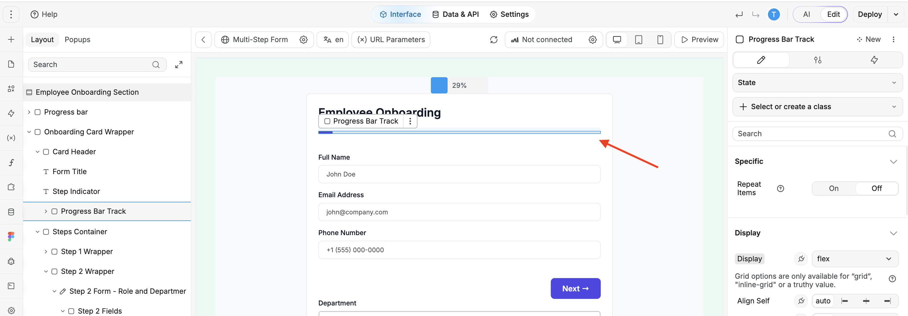
3. Validation and Error Handling
Implement real-time validation to provide instant feedback on user input. Clearly highlight any errors and guide users to rectify them. Avoid submission until all errors are resolved.
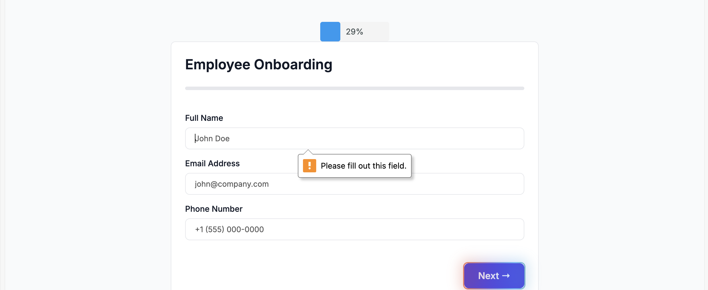
4. Mobile-Friendly Design
Ensure that multi-step forms are responsive and display well on various devices. Use mobile-specific design elements, like larger buttons and touch-friendly input fields, to enhance the mobile experience.
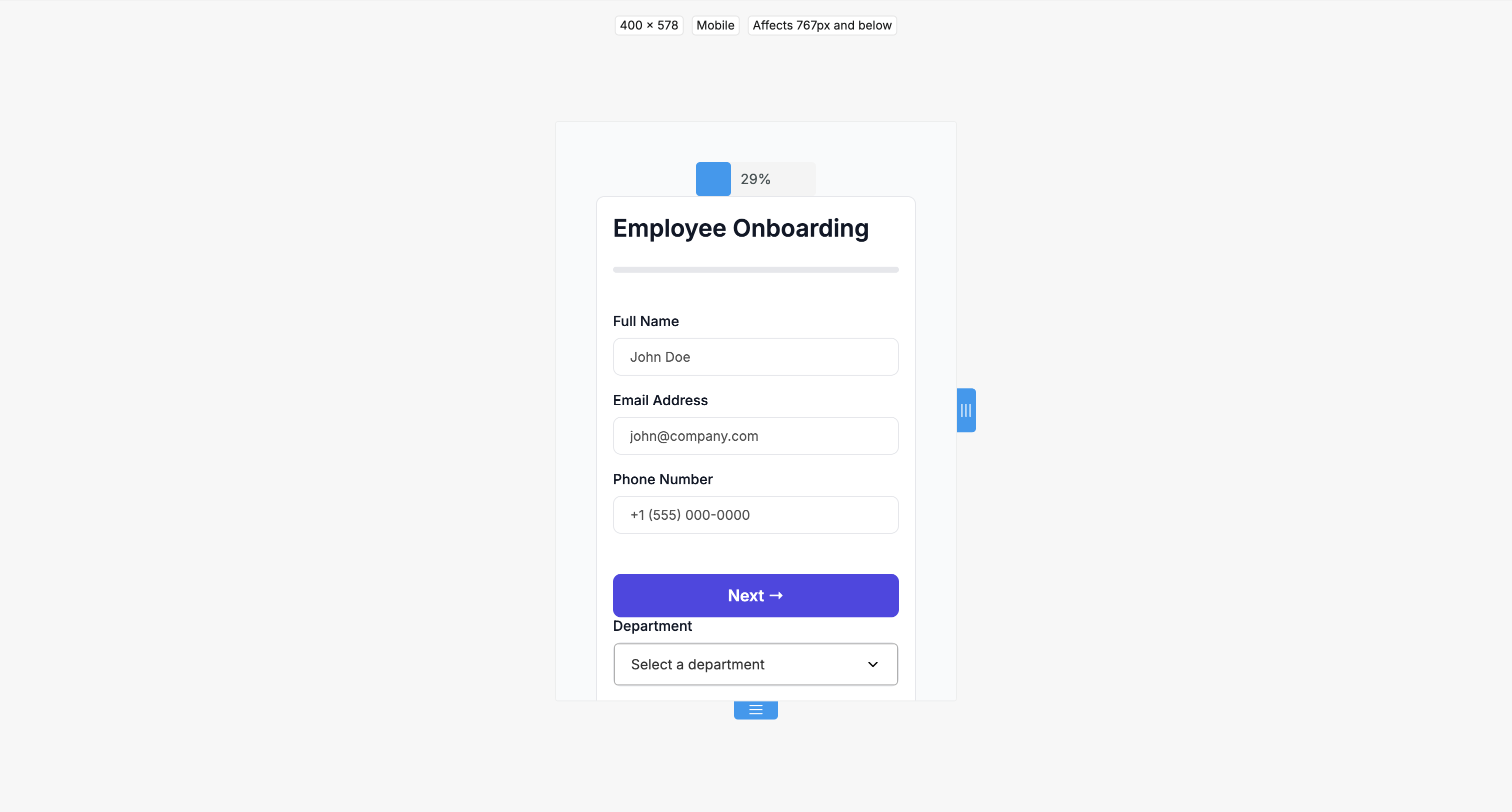
5. Save Progress
Allow users to save their progress and return later if the form is extensive. This feature can reduce abandonment rates and improve user satisfaction.

Designing Effective Multi-Step Forms
Optimizing Multi-Step Forms for Different Campaigns
For B2B audiences, multi-step forms often cater to complex purchase processes, requiring detailed information about the business's needs, budget, and decision-makers. Prioritize professional language, clear value propositions, and options for customization.
For B2C audiences, on the other hand, your primary objectives should be speed and simplicity. Prioritize a streamlined user experience by employing shorter forms that efficiently gather fundamental information like contact details and product preferences.
Creating customized conversion paths within multi-step forms is vital for both B2B and B2C contexts. Based on user responses, tailor subsequent steps to offer relevant options or content.
For example, a B2B form can adjust questions according to the user's industry, while a B2C form might adapt based on product preferences.
This personalization enhances the user experience, increases relevance, and ultimately boosts the effectiveness of the form, whether for lead generation, sales, or user engagement.
Addressing Form Abandonment
By implementing the following solutions and engagement strategies, you can mitigate common issues and maintain user engagement throughout the multi-step form completion process, ultimately reducing form abandonment.
- Progress Bars: Implement clear progress indicators, informing users of their position within the multi-step form. This reduces anxiety and encourages users to continue.
- Conditional Logic: Utilize conditional branching to tailor subsequent steps based on user responses. This keeps the form relevant and prevents users from encountering irrelevant fields.
- Inline Validation: Employ real-time validation to provide instant feedback on user input. Clearly highlight errors and offer guidance on how to correct them to reduce frustration and abandonment.
- Save & Resume: Enable users to save their progress and return later, particularly for longer forms. This feature caters to users' time constraints and enhances completion rates.
- Engaging Copywriting: Craft compelling and concise copy that guides users through each step, making the form more inviting and user-centric.
Multi-Step Forms as Marketing Tools
With their versatility and effectiveness in lead generation strategies, multi-step forms can be powerful marketing tools.
By employing multi-step forms, businesses can tailor their messaging to different audience segments, leveraging conditional logic to display personalized questions and content. For example, a travel booking site might show different sets of destination options based on whether the user selects "family vacation" or "business trip" in the initial steps of the form.
They can also use targeted pop-ups with enticing incentives to capture leads and encourage user engagement.
Designing Multi-Step Forms with WeWeb
As a tool specialized in full-stack app building, we appreciate modularity and other specialized tools like Tally and Typeform that do an incredible job at making form building accessible to all, with user-friendly drag-and-drop functionalities and a large catalogue of templates.
WeWeb also offers user-friendly drag-and-drop functionalities but goes one step further when it comes to customization tools. Indeed, in WeWeb, you can build pixel-perfect multi-step forms that includes dynamic data based on the user's profile or interactions.
In the example below, you can see we were able to clone Lemonade's multi-step onboarding form in WeWeb.

WeWeb provides comprehensive solutions for diverse business needs without compromising simplicity or functionality, making it the optimal choice for efficient and engaging multi-step form creation.
WeWeb is a versatile web design platform that empowers users to design, implement, and optimize multi-step forms. With its no-code approach, WeWeb enables users to create and customize multi-step forms with no coding expertise.
This platform offers a range of integrations, simplifying the process of collecting, analyzing, and acting upon the data gathered through these forms.
Its intuitive interface, pre-designed templates, and responsive design capabilities ensure that multi-step forms are not only user-friendly but also visually appealing and effective in boosting conversion rates.
The significance of well-designed multi-step forms cannot be overstated when it comes to marketing success and user experience.
These forms are not just tools for data collection. They are gateways to:
- enhanced engagement,
- increased conversion rates, and
- personalized user journeys.
If you're looking to harness the full power of multi-step forms and streamline your design process, try out WeWeb for free! With its user-friendly interface, advanced features, and interactive learning community, WeWeb can be your partner in creating dynamic and effective multi-step forms that elevate your digital presence and lead to success.


